Organizing Multiple Markets Inside a Trader Terminal
Managing a heavy trading load across different asset classes can quickly turn a clean interface into a chaotic wall of flashing red and green numbers. When you are monitoring highly correlated assets, a messy screen directly leads to missed executions and delayed exits. Successfully organizing multiple markets inside a trader terminal requires treating your screen space like high-value real estate. If a chart or data feed does not actively inform a decision you need to make within the next sixty seconds, it does not belong on your primary monitor.
Many retail traders fail because they build a single, massive workspace and try to cram every asset into it. A smarter approach involves partitioning your screen by asset behavior and liquidity profiles rather than random asset names. For example, keeping highly liquid macro assets on a primary display while burying speculative, slow-moving setups in secondary tabs prevents visual fatigue.
How do you decide what stays front and center? Experienced professionals group their screens dynamically by cross-asset relationships. Consider a practical scenario involving the US Dollar Index (DXY) and Gold (XAU/USD). When the Federal Reserve hints at a surprise interest rate hike, the DXY often spikes instantly, causing Gold to plunge seconds later. If you have these two specific instruments linked visually inside your trader terminal, you can spot the dollar breakout and enter a short position on Gold before the retail crowd catches up to the move.
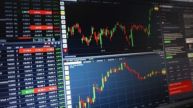
Image Source: Pixabay
Grouping by Visual Archetypes
The most efficient way to prevent cognitive overload is to standardize your layouts based on the specific strategy you are running. Instead of using the same chart style for everything, assign specific visual formats to different market conditions:
- The Macro Anchor: A single, large 4-hour candlestick chart for primary trend direction.
- The Execution Window: Twin 1-minute or 5-minute charts for precise entry timing.
- The Correlated Matrix: A compact grid of small, clean line charts showing related instruments.
- The Liquidity Feed: A dedicated panel for the order book or Time and Sales data.
Structuring your interface this way creates a predictable visual map for your eyes during high-volatility events. Instead of hunting through tabs to see what the broader trend is doing, your brain naturally maps the macro trend on the left and the immediate price action on the right. This layout cuts down on the microsecond delays that separate a profitable fill from a slipped order.
The Myth of the Multi-Monitor Setup
It is incredibly common to hear mentors advise beginners to buy as many screens as possible to track the entire market at once. However, academic research suggests that excessive screen real estate can actually damage performance. A study published by the Journal of Behavioral and Experimental Finance revealed that individual traders often suffer from an information processing constraint where managing more than four open positions simultaneously leads to a significant decrease in net returns due to cognitive overload.
More screens rarely equal more profit. In fact, a single, perfectly optimized workspace often yields better execution quality because it forces extreme selectivity.
Syncing Timeframes to Avoid Friction
To keep your workspace clean, make full use of workspace linking features. Most modern terminal software allows you to link specific windows by color codes. When you click a symbol in your watch list, every linked chart updates to that asset instantly.
This keeps your screen clear of redundant charts while allowing you to cycle through different asset classes seamlessly.
Build a Workspace for Execution
The final step in mastering your layout is ensuring your order entry panel sits in a neutral, easily accessible zone. A practical takeaway to implement today is to strip away any indicators that do not trigger an immediate action, leave only your core correlated assets visible, and group your charts strictly by their relationship to each other. Your interface should serve as a streamlined tool for execution, not an aesthetic dashboard for passive observation.